Sector
Packaging
Year
2018
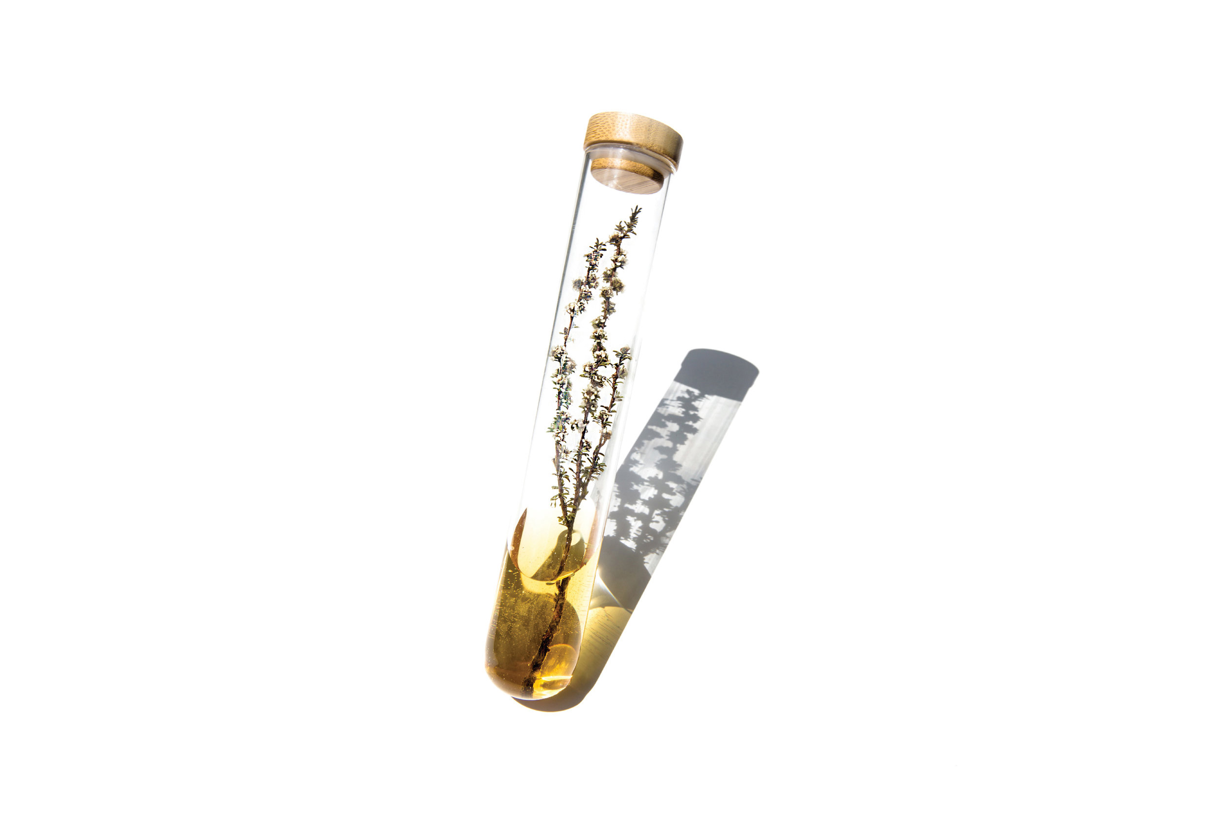
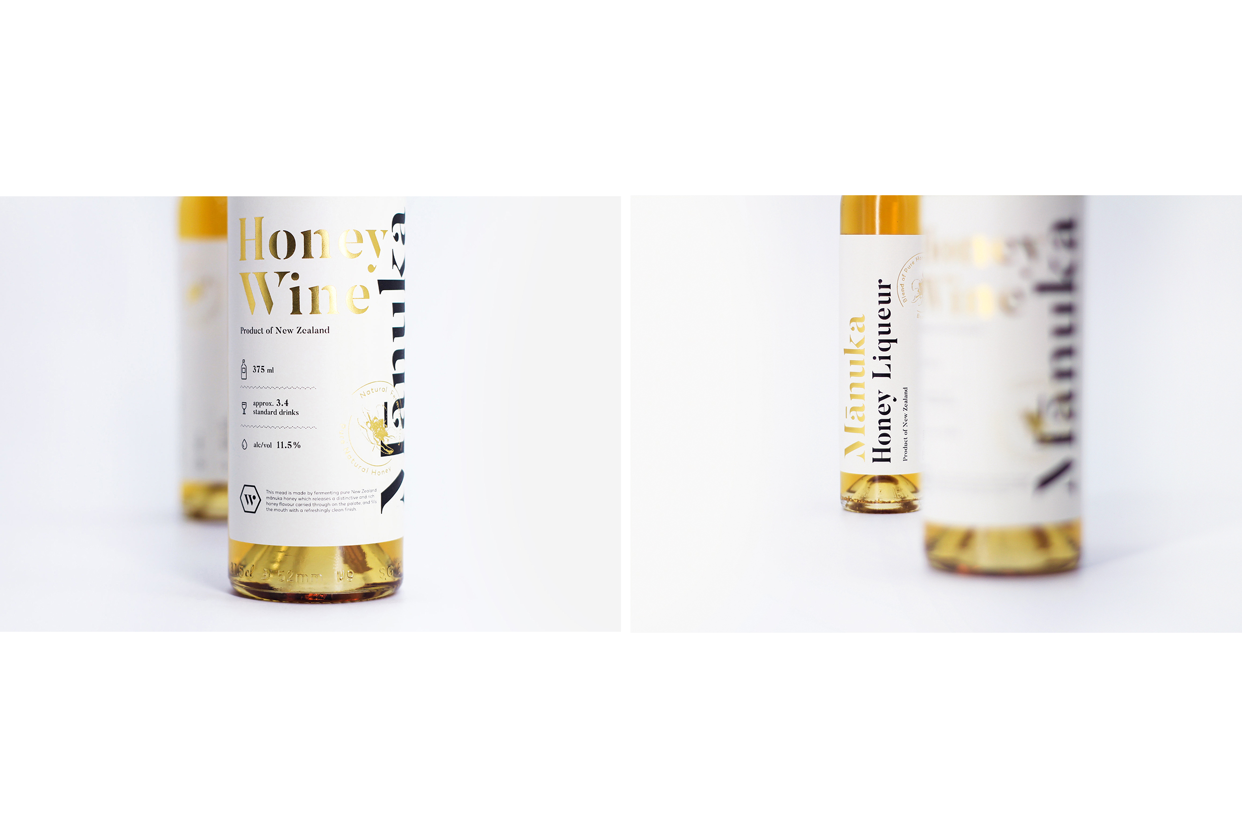
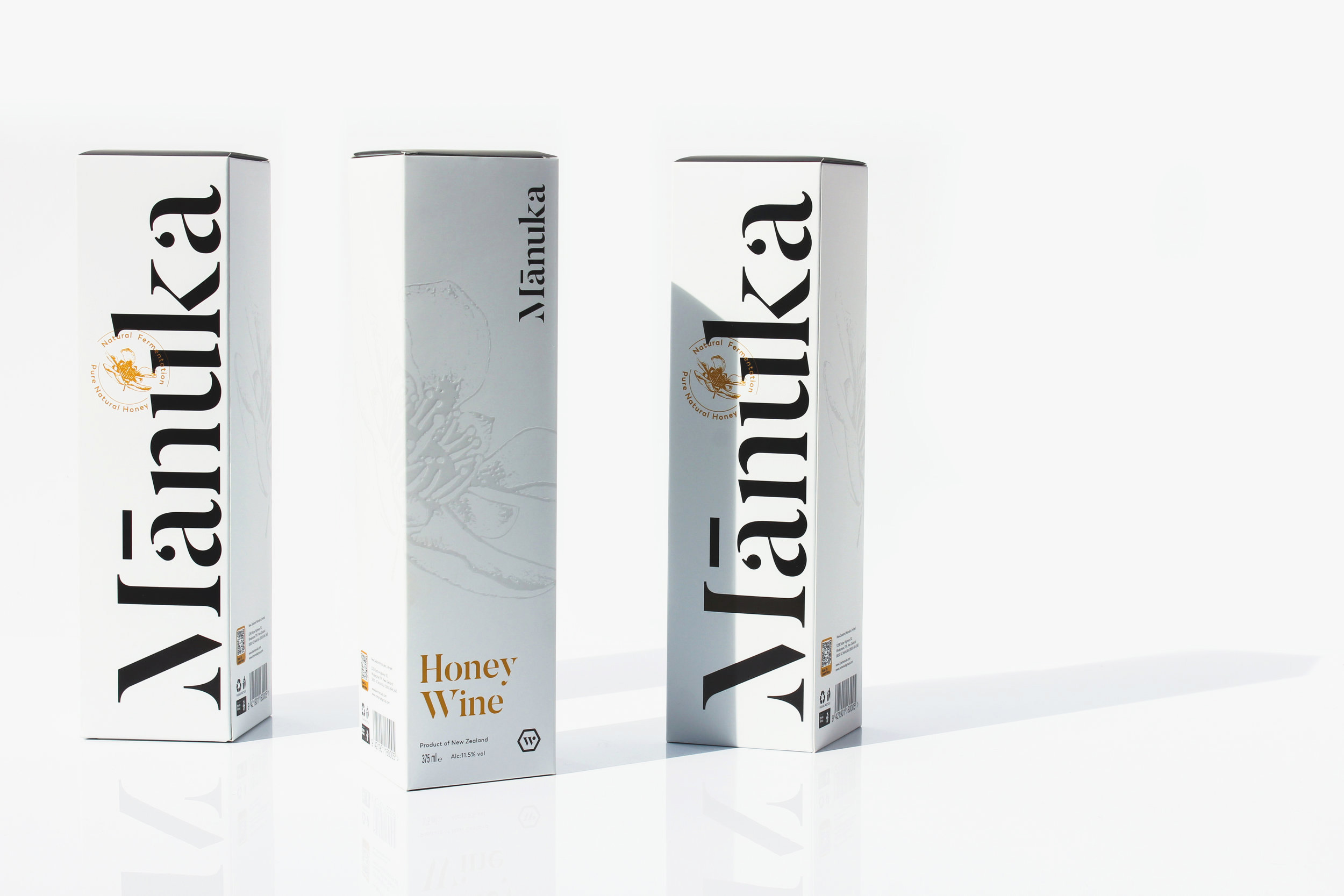
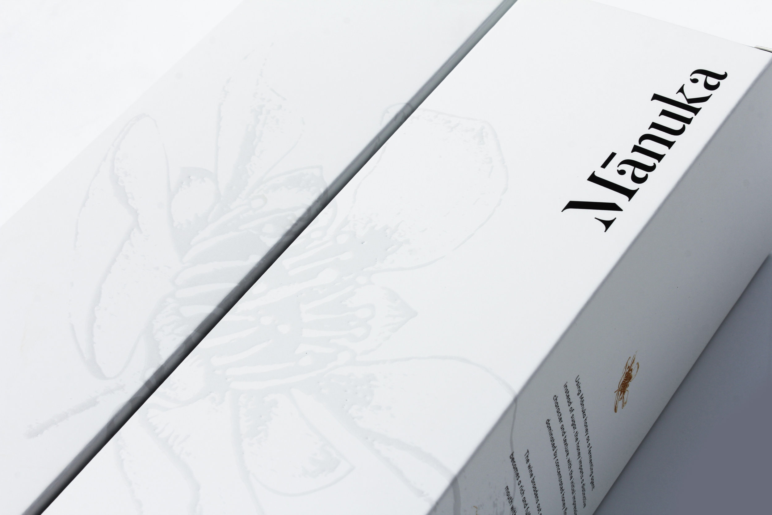
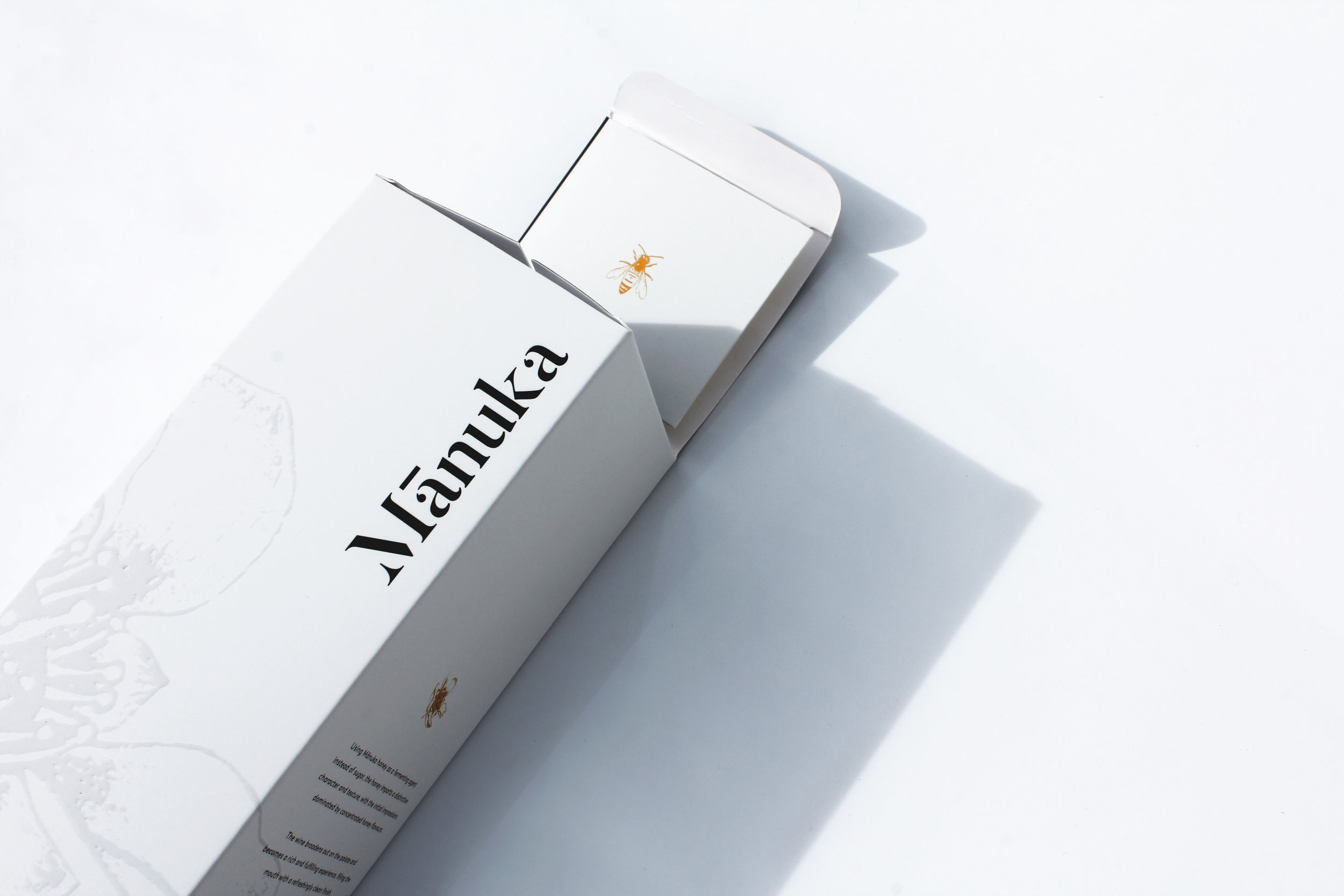
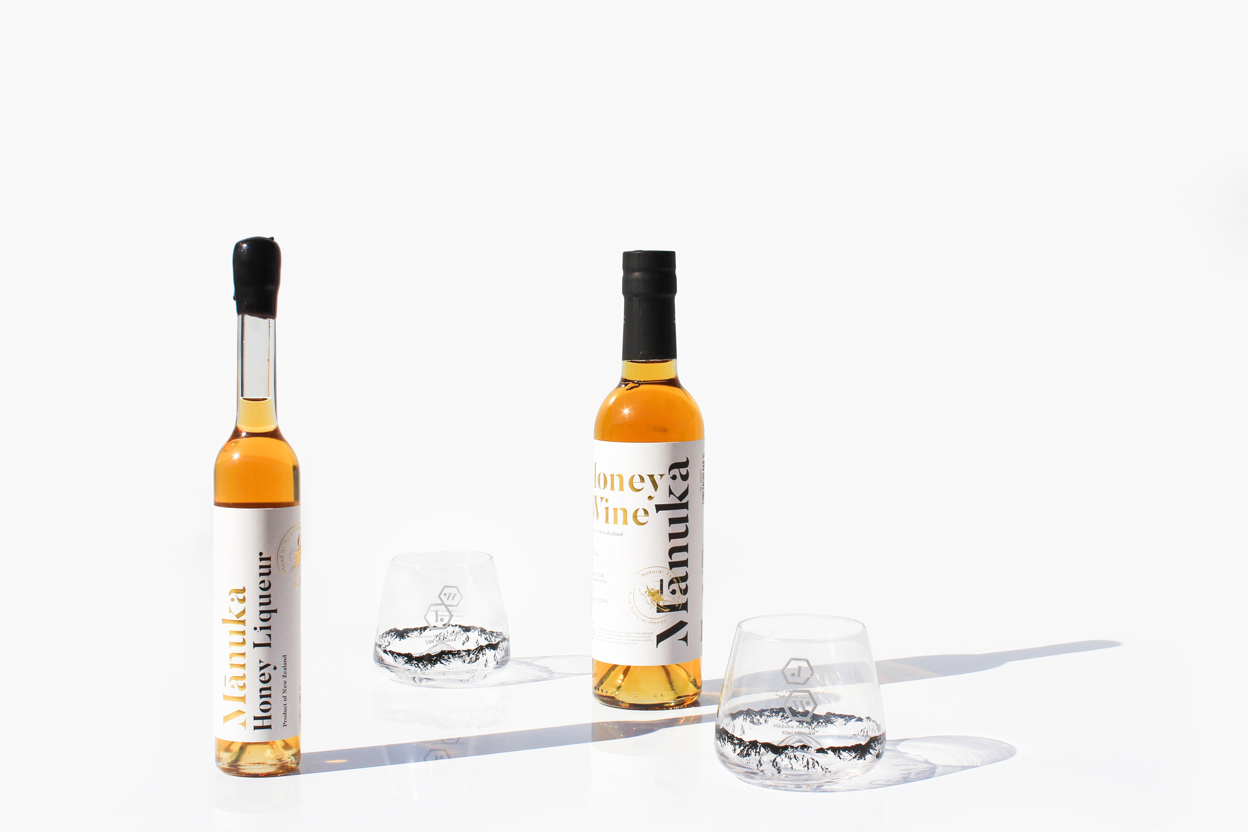
Knowing its origin from New Zealand, the design solution is to not just emphasis on its origin but also on the main ingredient that makes this wine special - Mānuka Honey. Using a clean and simple visual language with a serif type, it allows the main ingredient of this product to stand out. The chosen font gives the brand a classic approach, preparing for a global release whenever it is ready.
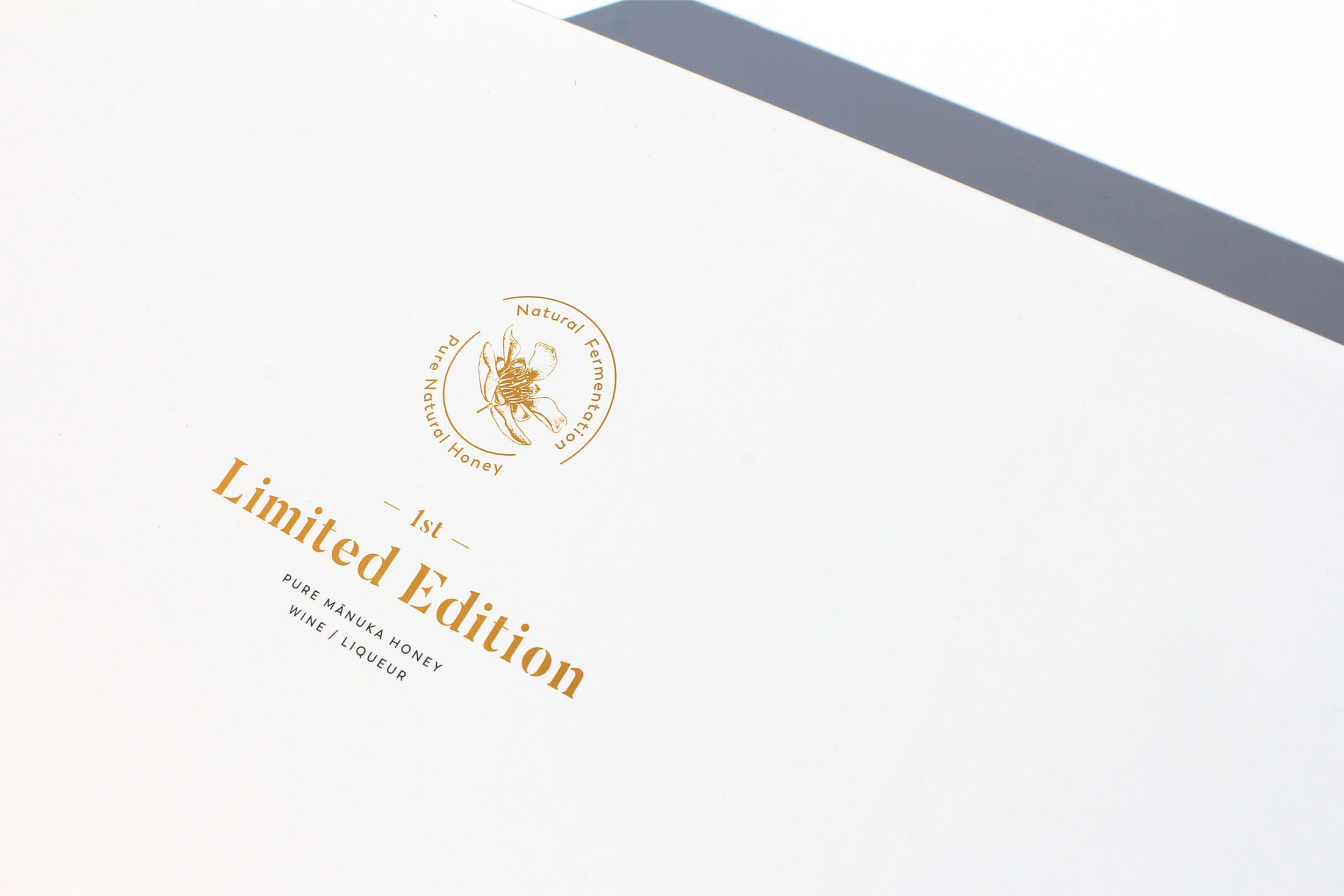
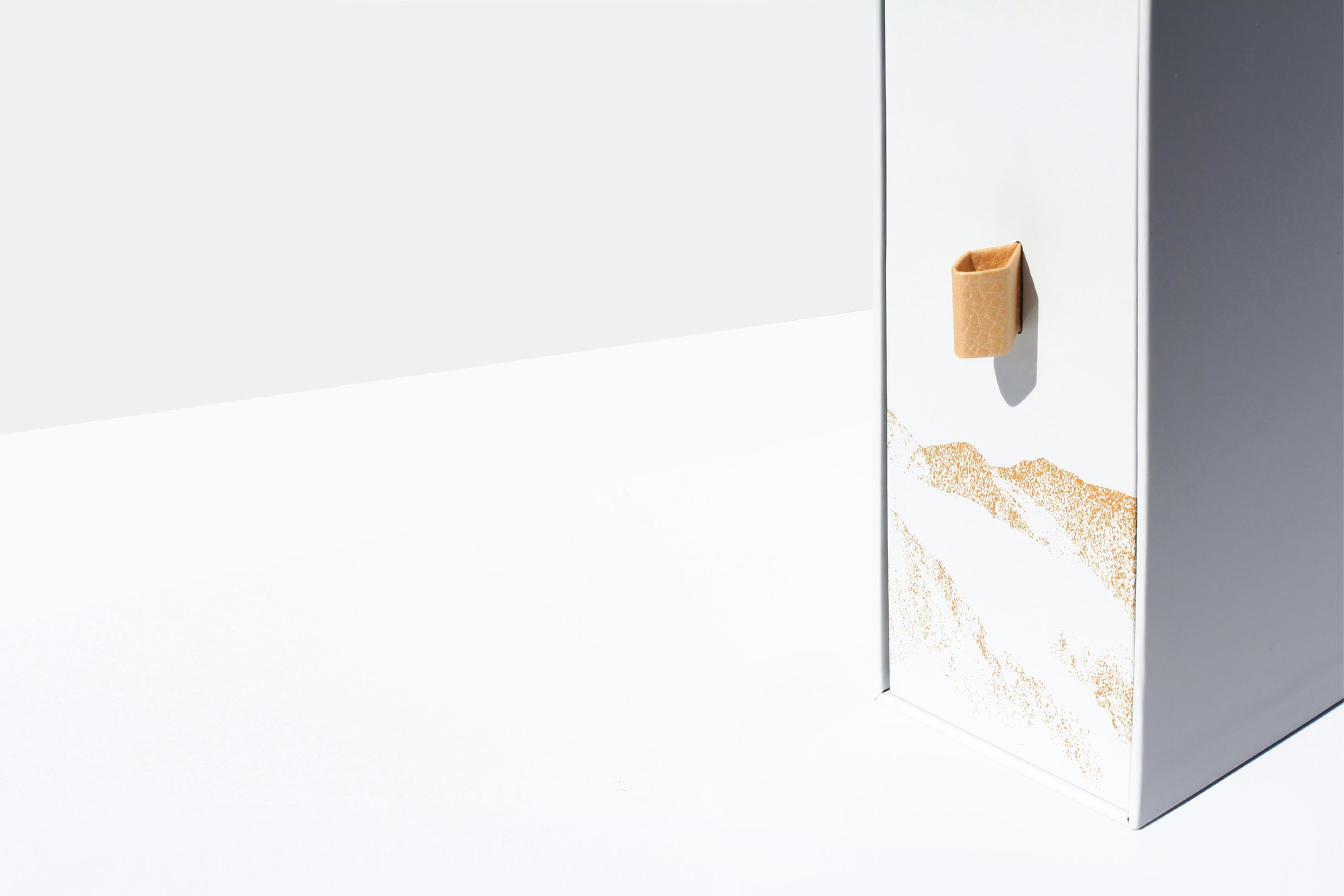
The design decision of using white space with gold foil was drawn from the experience of the tasting the products. Describing the finish note of this wine/liqueur as refreshing and crisp, both label is finished in a tone of simplicity yet exclusive to conclude the design.
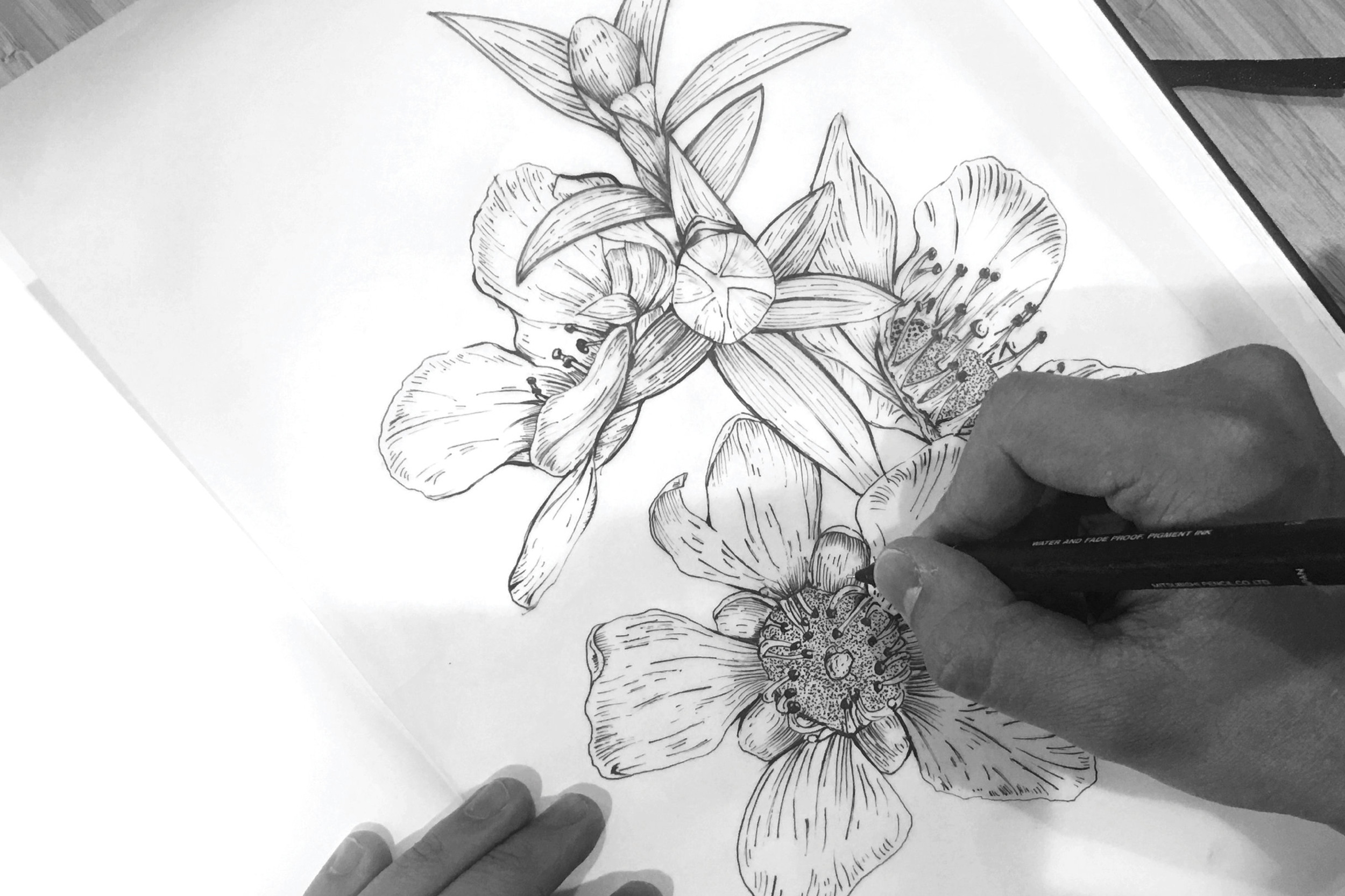
To differentiate the products from others, a Mānuka flower emblem has been created to mark this creation. Hand drawn Manuka flower was developed from scratch to convey the exquisite of these wine/liqueur.
